Exploring the Evolution of Kirby's Western Image: From "Angry Kirby" to Global Consistency

This article delves into the fascinating story behind Kirby's differing appearances in the US and Japan, as revealed by former Nintendo employees. We'll examine Nintendo's localization strategies and their impact on Kirby's marketing and overall brand perception.
A Tougher Kirby for Western Audiences?
The "Angry Kirby" phenomenon, characterized by a more determined, even fierce, portrayal of the character on Western game covers and artwork, was a deliberate marketing choice. Former Nintendo Localization Director, Leslie Swan, clarified that the goal wasn't to depict anger, but rather resolve. While cute characters resonate universally in Japan, Swan noted a perceived preference for tougher characters among American tween and teen boys. This aligns with comments from Kirby: Triple Deluxe Director, Shinya Kumazaki, who acknowledged that while cute Kirby drives Japanese appeal, a more battle-hardened image resonates more strongly in the US market. However, he also pointed out that this wasn't universally true, citing Kirby Super Star Ultra as an example of consistent artwork across regions.
Marketing Kirby: Beyond "Kiddie" Games
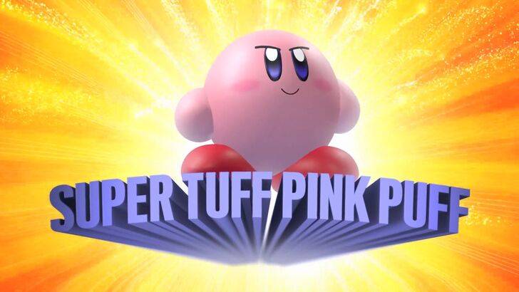
The "Super Tuff Pink Puff" marketing campaign for Kirby Super Star Ultra on the Nintendo DS exemplifies Nintendo's broader strategy to move beyond the "kiddie" label. Former Nintendo of America Public Relations Manager, Krysta Yang, highlighted the desire to cultivate a more mature image for Nintendo and the gaming industry as a whole. The focus shifted towards emphasizing the combat aspects of Kirby games, aiming to attract a wider, older demographic. While recent marketing has attempted to present a more well-rounded Kirby, the cute persona remains prevalent.
Regional Variations in Localization: A Historical Perspective
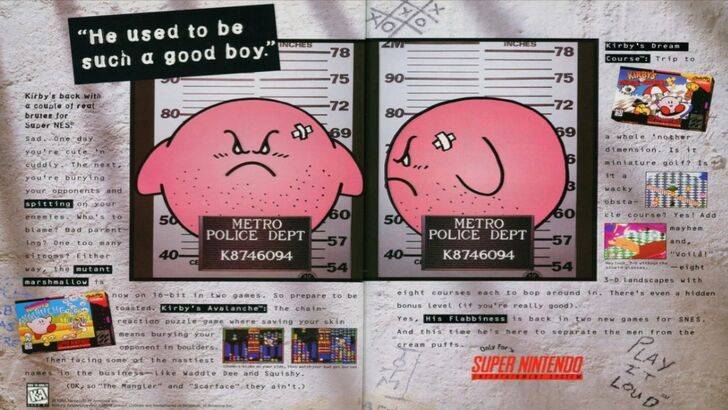
The divergence in Kirby's image between regions is deeply rooted in history. A 1995 "Play It Loud" advertisement featuring a mugshot-style Kirby is a prime example. Subsequent years saw variations in Kirby's facial expression across game box art, with titles like Kirby: Nightmare in Dream Land, Kirby Air Ride, and Kirby: Squeak Squad showcasing a more serious, even stern, Kirby. Even earlier, the monochrome Game Boy version of Kirby's Dreamland presented a ghostly-white Kirby, in contrast to his pink Japanese counterpart. This color difference, coupled with the perceived need to appeal to a broader Western audience, led to the stylistic adjustments in Kirby's depiction.
A Shift Towards Global Consistency
Both Swan and Yang concur that Nintendo has adopted a more globalized approach in recent years. Closer collaboration between Nintendo of America and its Japanese counterpart has resulted in more consistent marketing and localization efforts. The company is actively moving away from regional variations in artwork and marketing strategies, aiming for a unified brand image across all regions. While this ensures consistency, Yang acknowledges potential drawbacks, such as a perceived lack of regional nuance and potentially "bland" marketing. The current trend towards global consistency is influenced by the industry's globalization and the growing familiarity of Western audiences with Japanese culture.